
Typography is the unsung hero of web design. While colors and images grab attention, your choice of font works on a subconscious level, defining your brand's personality and determining whether your content is a pleasure or a pain to read. Choosing the right font can feel overwhelming, but by following a few simple principles, you can make a professional choice with confidence.
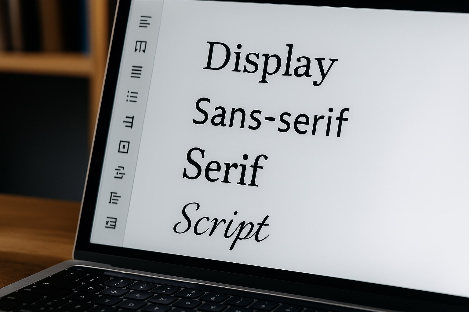
1. Understand the Two Main Font Families
For the web, fonts are primarily divided into two major groups:
- Serif Fonts: These fonts have small decorative strokes (called "serifs") at the end of their letters. They feel traditional, classic, and trustworthy. Think of fonts like Times New Roman and Georgia. Serif fonts are excellent for long-form content like blog posts because the serifs help guide the eye.
- Sans-Serif Fonts: "Sans" literally means "without." These fonts have clean, modern lines with no serifs. Think of fonts like Arial, Helvetica, and Poppins. Sans-serifs are incredibly versatile and are perfect for headlines, user interfaces, and conveying a sense of modernity and clarity.
2. Prioritize Readability Above All Else
A beautiful, artistic font is useless if your visitors can't read it. The primary goal of your body text is effortless readability. Keep these three factors in mind:
- Size: Don't make your users squint. For body text, a font size of 16px is the modern standard, and 18px is even better for long articles.
- Line Height: Give your text room to breathe. The space between lines of text (leading) should be around 1.5 to 1.7 times the font size.
- Contrast: Ensure your text color has sufficient contrast against your background. Use our Color Contrast Checker to verify your combinations.
3. Match the Font to Your Brand's Voice
What is the personality of your brand? Your font should reflect it.
- Is your brand traditional, academic, or luxurious? A classic Serif font might be a great fit.
- Is your brand modern, tech-focused, and approachable? A clean Sans-Serif is likely the best choice.
- Is your brand playful or artistic? You might use a more unique Display font, but use it sparingly—for logos or major headlines only.
4. Use a Simple Font Pairing Strategy
Resist the temptation to use too many fonts. A busy website looks unprofessional. A simple and effective strategy is the "Rule of Two": one font for headings and another for body text.
- High-Contrast Pairing: A classic approach is to pair a Sans-Serif heading with a Serif body font. The contrast creates a clear hierarchy.
- Single Font Family: An even safer approach is to use a single family (like Poppins) and simply use different weights (e.g., Bold for headings, Regular for body text).
Where to Find Great, Free Fonts
The best place for web fonts is Google Fonts. It's a massive library of high-quality, open-source fonts that are completely free to use. They are easy to implement and are optimized for web performance.
By keeping these principles in mind, you can select a typeface that not only looks great but also enhances your message and builds trust with your audience.