
Choosing a color scheme is often the most intimidating part of starting a new project. If you aren't a trained color theorist, picking colors that "feel right" together can involve hours of frustrating trial and error. But there is a shortcut that professional designers use all the time: stealing from reality.
The real world is full of naturally occurring, perfect color harmonies. By finding a photo that captures the mood you want, you can extract a mathematically perfect palette in seconds.
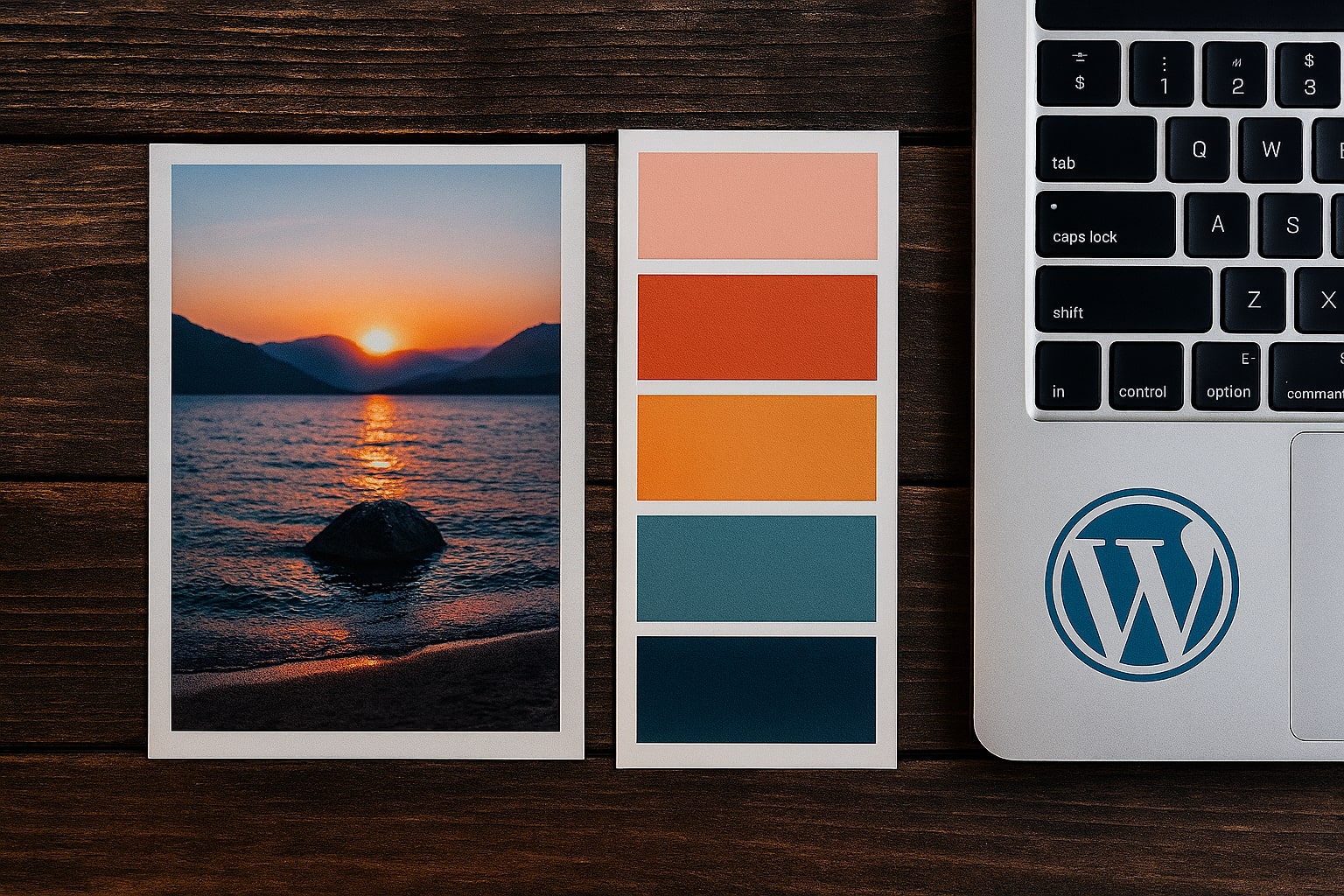
Step 1: Find Your "Inspiration Image"
Don't look for colors; look for a feeling. Browse sites like Unsplash, Pinterest, or even your own camera roll. Look for an image that embodies the emotion of your brand.
- For a Calm, Trustworthy Brand: Look for photos of oceans, slate-grey mountains, or blue skies.
- For a High-Energy, Youthful Brand: Look for street art, neon signs, or tropical fruits.
- For a Luxury, Elegant Brand: Look for photos of black marble, gold jewelry, or deep velvet fabrics.
Once you find an image that makes you say, "Yes, this is the vibe," save it.
Step 2: Extract the Data
You don't need to guess the colors by eye. You need the exact computer-readable HEX codes.
- Open our Image Color Palette Generator.
- Upload your inspiration image.
- The tool will instantly analyze the pixels and extract the 6 most dominant, harmonious colors.
- Click on the color swatches to copy the HEX codes (e.g., #FF5733) to your clipboard.
Step 3: Apply the 60-30-10 Rule
Now that you have your palette, how do you use it? You shouldn't use every color equally. The 60-30-10 rule is a classic interior design principle that works perfectly for websites and branding:
- 60% Primary Color: This is usually a neutral color (white, beige, light grey, or a very dark charcoal). It sets the stage. Use this for backgrounds and negative space.
- 30% Secondary Color: This supports the primary color. It's distinctive enough to be interesting but not overpowering. Use this for cards, footers, or secondary headings.
- 10% Accent Color: This is the boldest color in your palette. It's used sparingly to guide the eye. Use this for Call-to-Action (CTA) buttons, links, and key highlights.
Why This Method Works
Nature rarely gets color wrong. A sunset doesn't clash; a forest looks cohesive. By deriving your palette from a photo, you are guaranteeing that your colors share a tonal relationship (temperature, saturation, and brightness) that is naturally pleasing to the human eye.
Stop guessing at the color wheel. Find a photo you love, extract the palette, and start designing with confidence.